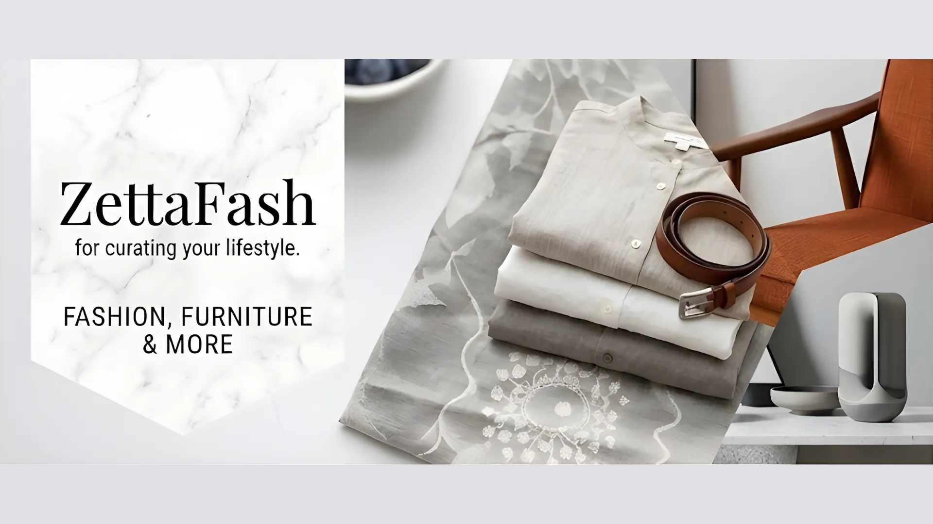
UX/UI Redesign for Online Fashion & Lifestyle Shopping: ZettaFash
UX/UI Redesign · E-Commerce · Fashion & Lifestyle · Web Application
Project Overview
ZettaFash is a UX/UI redesign project for an online shopping platform that brings together fashion, furniture, home decor, and lifestyle accessories. Our team reimagined the entire user experience under the tagline “for curating your lifestyle”—redesigning editorial-style event pages, featured collections with seasonal themes, product detail flows, and a streamlined shopping journey from discovery to checkout.
Design Challenge
Redesign the entire shopping experience across 6+ product categories—Fashion Apparel, Designer Furniture, Home Decor, Lifestyle Accessories, Jewelry & Watches, and Artisan Goods—into a unified, editorial-quality interface.
Our Approach
We developed a warm, editorial visual language with marble textures, earthy tones, and curated layouts that strengthen the brand identity while improving usability throughout the platform.
UX/UI Design Highlights
Homepage & Navigation Redesign
Redesigned the homepage with a magazine-style layout featuring hero banners, sidebar navigation with About, Categories, and social links, plus a visual category system with icons for intuitive browsing.
Editorial Event Pages
Designed seasonal event pages like “The Autumn Harvest” with editorial photography, product grids, and a “Go to Event” call-to-action flow.
Product Detail Experience
Crafted clean product detail pages with large imagery, pastel color pickers, tabbed description/tag panels, pricing with strikethrough discounts, and related product recommendations.
Visual Identity & Design System
Established a design system with warm earthy tones, marble textures, serif typography for headings, and consistent spacing for a premium, lifestyle-oriented brand feel.
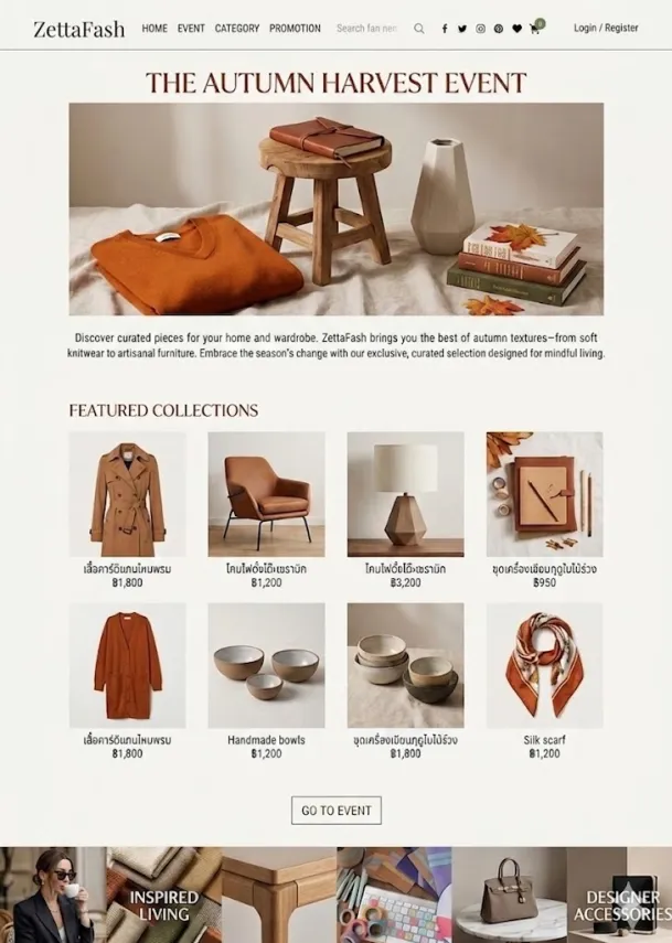
Event Page Redesign — editorial layout with seasonal collections, product grids, and photography
Design Process
A structured UX/UI redesign approach from research to final delivery.
Research & Analysis
Analyzed existing user flows, identified pain points in navigation and product discovery, and benchmarked against leading fashion e-commerce platforms to define the redesign direction.
Wireframing & Prototyping
Created wireframes and interactive prototypes for key screens—homepage, event pages, product listings, product detail, and cart—iterating based on feedback to optimize the user journey.
Visual Design & Handoff
Delivered high-fidelity mockups with a complete design system, component library, and developer-ready specifications for smooth implementation.
Technical Specifications
Responsive Design
Designed for all screen sizes with adaptive layouts for desktop, tablet, and mobile—keeping the experience consistent across every device.
Multi-language Ready
UI designed with Thai and English language support in mind, including proper text spacing for Thai script and localized price formatting in Baht (฿).
Design System & Components
A reusable component library with defined color palette, typography scale, spacing tokens, and UI patterns for consistent design across all pages.
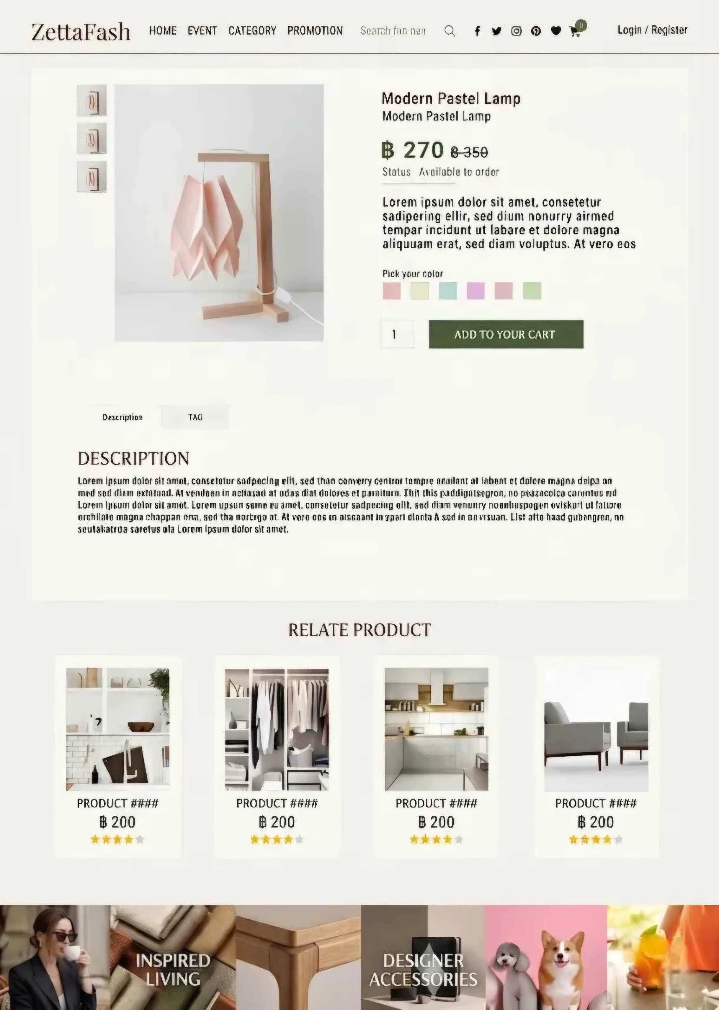
Product Detail Redesign — clean layout with color picker, pricing, tabbed descriptions, and related product recommendations